Widget Type:
Form Widgets
TPC Version:
  • 4.0
lookuplogo
The Lookup widget is a drop down list equipped with a search bar. It queries using FetchXML and has the ability to look up any type of record. The widget can be configured to add and edit fetched records as well.

In case of large data sets the lookup dropdown loads sorted records dynamically. Users also have the ability to scroll down the list or use a searchbar.
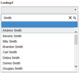
LookupEXample

Configuration

Basic

Make sure you have a CRM Form Configuration and a TPC Form Layout already attached and configured or else you won't see any fields for the widget.

Drag and drop the CRM Lookup from The Portal Connector tools into the body of your form and click edit to display the properties prompt.

The Basic Tab for the Lookup contains options allowing you to determine if a user is allowed to Add or Edit Records.
lookup-instruction-1

Data

The data tab is used for defining FetchXML, which will determine what sorts of records the lookup will fetch. You have the option of working with the primary entity (The entity that the form is configured to use) or any other entity that the primary one has a relationship with. 

The FetchXML text area determines what sort of data a widget will be populated with. Clicking the Load Default Fetch option will populate the FetchXML area with a default fetch based on the CRM Entity chosen. Clicking the Build button FetchXML builder window will open. 

For more information on how to use the fetch builder, please see the FetchXML Builder How-To.

lookup-instruction-2

Appearance

The appearance tab contains the option to enter placeholder text for the widget, which allows you to set some transparent text that will appear in the lookup when it is empty.

lookup-instruction-3

Filters

The Filters tab contains a myriad of options to filter the records that the widget fetches. For example, you can filter records by the logged-in contacts' ID or by a query string value.

For more information, please see the Filtering Records How-To.

lookup-instruction-4

Widget Properties

Basic Properties

CacheData

This property enables/disables CRM data caching. Defaults to false.

Title

The Title text box will allow you to set the label of your widget. The title will usually appear above the associated widget.

Attribute

The Attribute drop down list will allow you to change the data field that this widget will save the user’s input to (For example, a CRM Text Field with an Attribute of Account Name will save its input to the Account Name data field).

Allow Adding Records

The Allow Adding Records checkbox allows users to add records to the CRM Entity that the widget is configured to use. When checked, you will be prompted to choose a page or a form from which the widget will use to add records.

Allow Editing Records

The Allow Editing Records checkbox allows users to edit existing records from the CRM Entity that the widget is configured to use. When checked, you will be prompted to choose a page or a form from which the record will be edited from.

Read Only

The Read Only checkbox will not allow the user to interact with the widget when checked.

Hidden

The Hidden checkbox will hide the widget from the page when checked.

Required Field

The Required Field checkbox will not allow a user to successfully submit the form until there is data within it. 

Upon selecting the checkbox, you will be prompted to enter an error message for invalid input.

ClientSideRequired

Allows you to enable or disable "required" from client side  

Fetch XML

The FetchXML text area determines what sort of data a widget will be populated with. 

Clicking the Load Default Fetch option will populate the FetchXML area with a default fetch based on the CRM Entity chosen. By clicking the Build button, we will be sent to another page in order to determine what the widget will look up. For more information on how to use the FetchXML function.

Empty Placeholder

The Empty Placeholder textfield will ‘fill’ the text box with whatever you enter here. This can be used to help guide user input or to give an example of proper input.

Tool Tip

The Tool Tip allows you to add a description or Hint to your widget.

ToolTipPosition

This property determines the position of the tool tip. By default this property is set to "Auto". You can change this to Left , Right , Top , Bottom. 

Prepopulate First Value

When this property is set to true the first value of the lookup will be populated.

Allow Deleting Records

The Allow Deleting Records checkbox allows users to delete existing records from the CRM Entity that the widget is configured to use.

RequiredIndicationLabel

The label text that appears next to the widget when marked as required.

EncryptGuids

The EncryptGuids advanced properties determines whether Guids should be encrypted or not. By default this is set to true.

LabelPosition

The LabelPosition advanced property specifies where the label of a widget will appear. By default, the label will appear on top of the widget. Applicable options include: Top and left. The content of the label is controlled by the Title property. The default value for this is 'Top'.

AddButtonText

The AddButtonText advanced property allows you to set the text that will appear inside of the add button. By default this is 'Add'.

EditButtonText

The EditButtonText advanced property allows you to set what text will appear in the edit button. By default this is 'Edit'.

WindowWidth

The WindowWidth advanced property allows you to define a default height for any pop-up windows to use. By default this is set to 1024 pixels. Please note that if the Window Auto Size advanced property is set to true, this property will not apply.

WindowHeight

The WindowHeight advanced property allows you to define a default height for a pop-up window to adhere to. By default this is set to 640 pixels. Please note that if the Window Auto Size advanced property is set to true, this property will not apply.

Advanced Properties

Advanced properties provide additional functionality. They can be accessed by clicking on the "Advanced" Button in the bottom right corner of the widget designer.

CacheData

This property enables/disables CRM data caching. Defaults to false.

Title

The Title text box will allow you to set the label of your widget. The title will usually appear above the associated widget.

Attribute

The Attribute drop down list will allow you to change the data field that this widget will save the user’s input to (For example, a CRM Text Field with an Attribute of Account Name will save its input to the Account Name data field).

Allow Adding Records

The Allow Adding Records checkbox allows users to add records to the CRM Entity that the widget is configured to use. When checked, you will be prompted to choose a page or a form from which the widget will use to add records.

Allow Editing Records

The Allow Editing Records checkbox allows users to edit existing records from the CRM Entity that the widget is configured to use. When checked, you will be prompted to choose a page or a form from which the record will be edited from.

Read Only

The Read Only checkbox will not allow the user to interact with the widget when checked.

Hidden

The Hidden checkbox will hide the widget from the page when checked.

Required Field

The Required Field checkbox will not allow a user to successfully submit the form until there is data within it. 

Upon selecting the checkbox, you will be prompted to enter an error message for invalid input.

ClientSideRequired

Allows you to enable or disable "required" from client side  

Fetch XML

The FetchXML text area determines what sort of data a widget will be populated with. 

Clicking the Load Default Fetch option will populate the FetchXML area with a default fetch based on the CRM Entity chosen. By clicking the Build button, we will be sent to another page in order to determine what the widget will look up. For more information on how to use the FetchXML function.

Empty Placeholder

The Empty Placeholder textfield will ‘fill’ the text box with whatever you enter here. This can be used to help guide user input or to give an example of proper input.

Tool Tip

The Tool Tip allows you to add a description or Hint to your widget.

ToolTipPosition

This property determines the position of the tool tip. By default this property is set to "Auto". You can change this to Left , Right , Top , Bottom. 

Prepopulate First Value

When this property is set to true the first value of the lookup will be populated.

Allow Deleting Records

The Allow Deleting Records checkbox allows users to delete existing records from the CRM Entity that the widget is configured to use.

RequiredIndicationLabel

The label text that appears next to the widget when marked as required.

EncryptGuids

The EncryptGuids advanced properties determines whether Guids should be encrypted or not. By default this is set to true.

LabelPosition

The LabelPosition advanced property specifies where the label of a widget will appear. By default, the label will appear on top of the widget. Applicable options include: Top and left. The content of the label is controlled by the Title property. The default value for this is 'Top'.

AddButtonText

The AddButtonText advanced property allows you to set the text that will appear inside of the add button. By default this is 'Add'.

EditButtonText

The EditButtonText advanced property allows you to set what text will appear in the edit button. By default this is 'Edit'.

WindowWidth

The WindowWidth advanced property allows you to define a default height for any pop-up windows to use. By default this is set to 1024 pixels. Please note that if the Window Auto Size advanced property is set to true, this property will not apply.

WindowHeight

The WindowHeight advanced property allows you to define a default height for a pop-up window to adhere to. By default this is set to 640 pixels. Please note that if the Window Auto Size advanced property is set to true, this property will not apply.

API

add_valueChanged()

Fired when the value of the widget is changed by the user. 
The event handler function context (available via the this keyword) will be set to the widget instance.

Returns

None

get_type()

Returns the widget type.

Returns

String

enable()

Enables the widget on the form.

Returns

None

required()

Enables or disables client side validation.

Returns

None

remove_valueChanged()

Removes any delegate hooked up to the add_valueChanged() event.

Returns

None

set_textValue()

Sets the value of the widget by a text label.

Returns

None

disable()

Disables the widget on the form.

Returns

None

clear()

Clears the value of the widget.

Returns

None

get_addButton()

Returns the add button element associated with the widget.

Returns

jQuery Object     

get_container()

Returns the container element of the widget.

Returns

jQuery Object

get_editButton()

Returns the edit button element associated with the object.

Returns

jQuery Object

get_element()

Returns the element associated with the widget.

Returns

jQuery Object

get_fetchValue()

Returns the value of the widget that is compatible with FetchXML filtering.

Returns

String

get_input()

Returns the input element of the widget.

Returns

jQuery Object

get_kendoInput()

Returns the Kendo DropDownList Object associated with the widget.

Returns

Kendo Object: Kendo.ui.DropDownList

get_kendoWindow()

Returns the Kendo Window Object associated with the widget.

Returns

Kendo Object: Kendo.ui.Window

get_model()

Returns the model object of the widget, which contains a number of useful properties related to the widget.
In the case of the Lookup widget, these returned properties and their types are:

  • AddRecordPageUrl: String
  • AllowAddingRecords: Boolean
  • AllowEditingRecords: Boolean
  • CascadeFields: Array
  • ControlDataId: String
  • DisplayAttribute: String
  • EditRecordPageUrl: String
  • EnableVirtualization: Boolean
  • ReadOnly: Boolean
  • ValueAttribute: String
  • WindowHeight: Integer
  • WindowWidth: Integer

Returns

Object

get_value()

Returns the value of the widget.

Returns

String

get_windowPlaceholder()

Returns the modal window associated with the widget.

Returns

jQuery Object

hide()

Hides the widget from the form.

Returns

None

show()

Shows the widget on the form.

Returns

None

set_value()

Sets the value of the widget.

Returns

None

toggle()

Toggles the visibility of the widget.

Returns

None

readonly()

Sets the widget state to read only.

Returns

None