
There are many interactive widgets we have seen over the internet from image sliders, accordions, panels to interactive time lines, interactive icon lists etc. At first, it might seem really complicated to add one of these to a Portal Connector website. However, this is not even close to being true! In this article, let’s have a look at how we can create a custom interactive widget in few easy steps.
First, we need to find a good JavaScript image slider library that we can integrate to our custom interactive widget. In this example, I’m going to use the Owl Carousel. Here are the details:
Step One
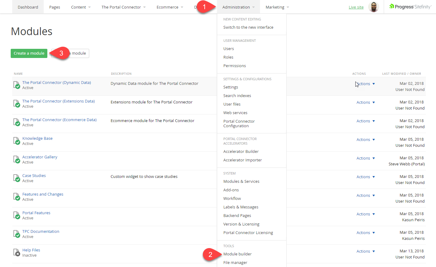
Go into Sitefinity Backend > Administration > Module Builder and click on "Create a module". (Please refer to the screenshot below)
Give the new module a name that you would like it to be called. In this case, I’m naming it “Main Slider”. Next, go to the next window, enter a name for the content type. In this case, I’m naming it "Slides".
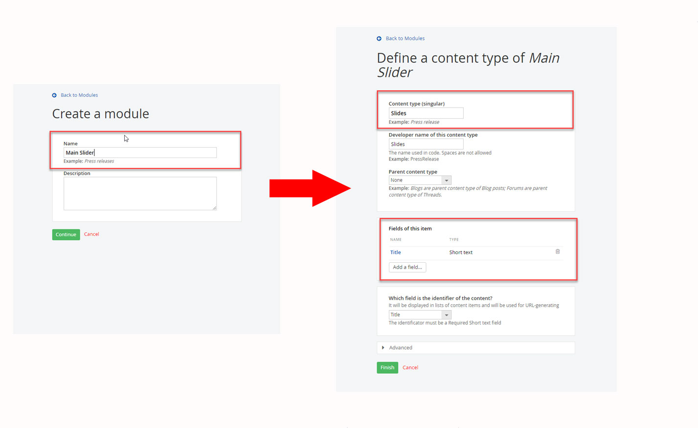
In this widget, I would like to have a call-to-action button, some text and the image on each slide. Therefore, we need to create these fields, so users can input data. To add these fields to our custom widget, click on the “Add a Field” Button and it will open a popup.
On the on the popup window, you can give the Field Name, Field Type and Field Interface (how it’s going to look like on the front-end) depending on what fields you are creating.
The Title field is created by default and here are the fields that we need to create in this module:
|
Name
|
Type
|
Interface
|
Data Type
|
|
CallToActionButtonLink
|
Related Data
|
-
|
Pages
|
|
CallToActionButtonText
|
Short Text
|
Textbox
|
-
|
|
SliderImage
|
Related Media
|
-
|
Images
|
You will notice that, every time you are creating a field, you also must define certain properties when you click on “Continue”. You can change any of these properties to suit your needs.
For example, I want to limit how many images that can be added to one slider. Therefore, when I’m creating the “SliderImage” field, and when I click “Continue” it will take me to the Properties window. Here, I will click on the Limitations tab and select “Only 1 image can be uploaded or selected”.
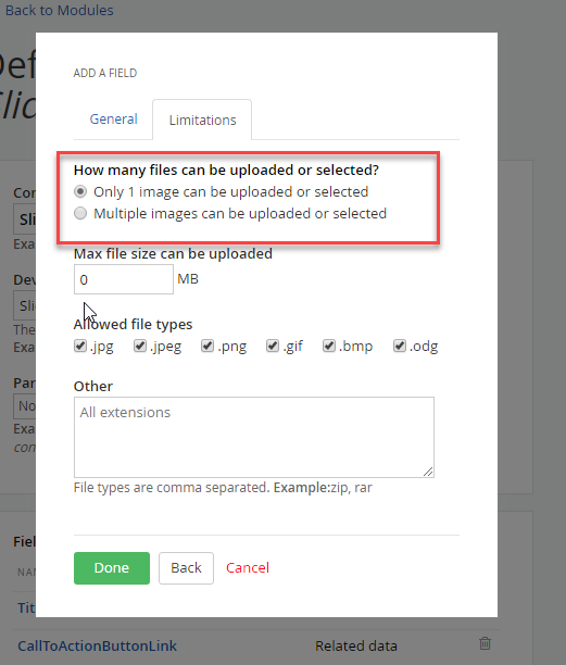
Please note: Some of these settings can only be added at the time of creating the field. This means that if you miss some properties, you might have to delete the entire property and add it back again.
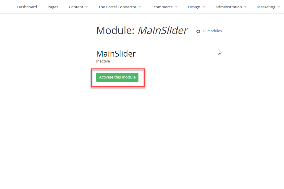
Once you create all the fields, click on “Finish” then click on “Activate this module” in the next screen to complete the creation of the widget.
Step Two
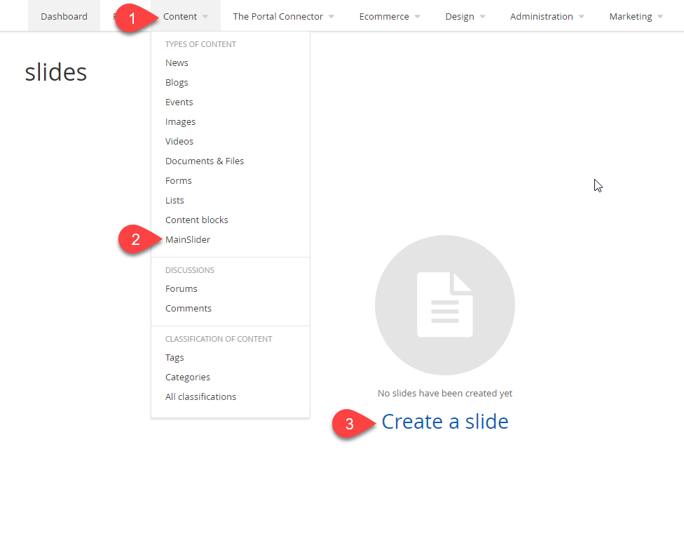
Surprise! We are almost halfway through our new slider widget, but first we need to add slides to the slider. To add sliders, go into Sitefinity backend > Content > Main Slider > Create a slide (please refer to the screenshot below)
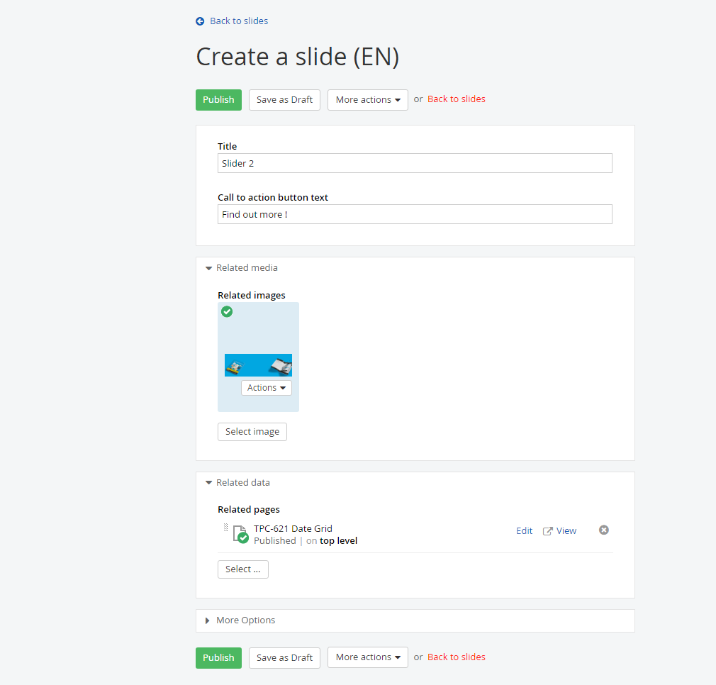
Now you can go ahead and add a few slides to the slider. For this widget I have added two slides, and here is a screenshot of one of the slides:
Step Three
For every custom content module that we create, Sitefinity generates two templates. One is the list view template to show list of records - in our case, this will be list of slides - and the other is detail view template to show detail of each record. For our widget, we will have to modify the list view template by using some of the elements from the detail view template.
To locate the list view template and the detail view template for our widget, navigate to Sitefinity Backend > Design > Widget Templates > and locate the MVC slide template.
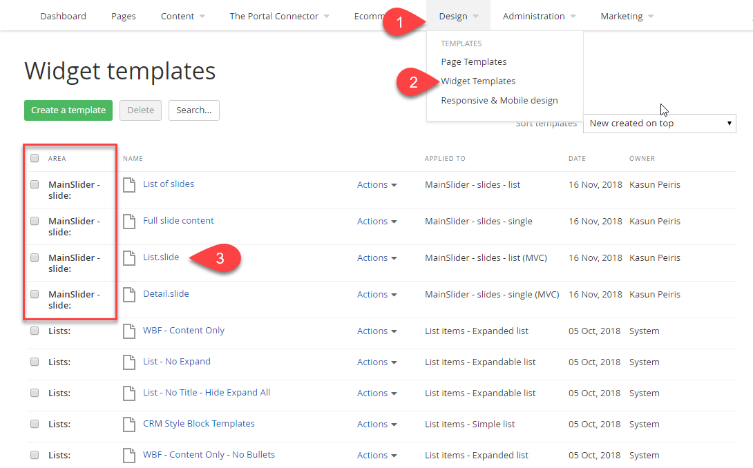
Note: You can find the right template for your widget by looking at the “Area” of the list of the templates (number 4 in the above screenshot). All the templates that are related to “Mainslider” widget are named as “MainSlider”.
List View Template (List.slide)
Let's have a look at our Sitefinity generated List View Template:
		@model Telerik.Sitefinity.Frontend.DynamicContent.Mvc.Models.DynamicContentListViewModel
		@using Telerik.Sitefinity.Frontend.DynamicContent.WidgetTemplates.Fields.Helpers;
		@using Telerik.Sitefinity;
		@using Telerik.Sitefinity.Data.ContentLinks;
		@using Telerik.Sitefinity.Frontend.Mvc.Helpers;
		@using Telerik.Sitefinity.Frontend.Mvc.Models;
		@using Telerik.Sitefinity.Web.DataResolving;
		@using Telerik.Sitefinity.Model.ContentLinks;
		@using Telerik.Sitefinity.Modules.Pages;
		@Html.Script(ScriptRef.JQuery, "top", false)


		<div class="@Model.CssClass">
			<ul>
				@foreach (var item in Model.Items){
				var navigateUrl = HyperLinkHelpers.GetDetailPageUrl(item, ViewBag.DetailsPageId, ViewBag.OpenInSamePage, Model.UrlKeyPrefix);
				<li>
					<h3>
						<a href="@navigateUrl">
							@item.Fields.Title
						</a>
					</h3>
					<div>
						@item.GetDateTime("PublicationDate", "MMM d, yyyy, HH:mm tt")
						@Html.CommentsCount((string)navigateUrl, item.DataItem)
					</div>
				</li>
				}
			</ul>

			@if (Model.ShowPager){
				@Html.Action("Index", "ContentPager", new { currentPage = Model.CurrentPage, totalPagesCount = Model.TotalPagesCount.Value, redirectUrlTemplate = ViewBag.RedirectPageUrlTemplate })
			}
		</div>
Detail View Template (Detail.slide)
Let's have a look at our Sitefinity generated Detail View Template:
		@model Telerik.Sitefinity.Frontend.Mvc.Models.ContentDetailsViewModel
		@using System.Collections;
		@using System.Linq;
		@using Telerik.Sitefinity.Frontend.DynamicContent.WidgetTemplates.Fields.Helpers;
		@using Telerik.Sitefinity;
		@using Telerik.Sitefinity.Data.ContentLinks;
		@using Telerik.Sitefinity.Frontend.Mvc.Helpers;
		@using Telerik.Sitefinity.Libraries.Model;
		@using Telerik.Sitefinity.Localization;
		@using Telerik.Sitefinity.Model;
		@using Telerik.Sitefinity.Model.ContentLinks;
		@using Telerik.Sitefinity.Modules.Pages;
		@using Telerik.Sitefinity.Pages.Model;

		<div class="@Model.CssClass">
			<h3>@Model.Item.Fields.Title</h3>
			<div>
				@Model.Item.GetDateTime("PublicationDate", "MMM d, yyyy, HH:mm tt")
				@Html.CommentsCount("", @Model.Item.DataItem)
			</div>
			@*Start CallToActionButtonText field*@
				<div>
				<strong>Call to action button text:</strong>
				<span>@Model.Item.Fields.CallToActionButtonText</span>
			</div>
			@*End CallToActionButtonText field*@

			@*Start SliderImage field*@
			@if(Model.Item.Fields.SliderImage != null){
				<img src="@Model.Item.Fields.SliderImage.Fields.MediaUrl" alt="@Model.Item.Fields.SliderImage.Fields.AlternativeText" title="@Model.Item.Fields.SliderImage.Fields.Title" />
			}
			@*End SliderImage field*@
			@*Start CallToActionButtonLink field*@
			<div>
				<strong>Related pages:</strong>
				<ul>
					@foreach (Telerik.Sitefinity.Frontend.Mvc.Models.ItemViewModel pageItem in Model.Item.Fields.CallToActionButtonLink){
					<li>
						<a href="@pageItem.DefaultUrl">
							@pageItem.Fields.Title
						</a>
					</li>
					}
				</ul>
			</div>
			@*End CallToActionButtonLink field*@

			@{
			if (Model.EnableSocialSharing){
			var item = Model.Item.DataItem as Telerik.Sitefinity.Model.IHasTitle;
			@Html.SocialShareOptions(item);
			}
			}

			@Html.CommentsList(@Model.Item.DataItem)
		</div>
Modified ListView Template
Let's have a look at the modified templates and what the differences are, as well as how I merged all into one template based on our requirements. Remember, our requirement is to create a list view template that contains text from the title, a call-to-action with custom text, and a single image.
@model Telerik.Sitefinity.Frontend.DynamicContent.Mvc.Models.DynamicContentListViewModel
@using Telerik.Sitefinity.Frontend.DynamicContent.WidgetTemplates.Fields.Helpers;
@using Telerik.Sitefinity;@using Telerik.Sitefinity.Data.ContentLinks;
@using Telerik.Sitefinity.Frontend.Mvc.Helpers;
@using Telerik.Sitefinity.Frontend.Mvc.Models;
@using Telerik.Sitefinity.Web.DataResolving;
@using Telerik.Sitefinity.Model.ContentLinks;
@using Telerik.Sitefinity.Modules.Pages;
@Html.Script(ScriptRef.JQuery, "top", false)
<!--Owl Carousel Style Sheets-->
<link rel="stylesheet" href="https://cdnjs.cloudflare.com/ajax/libs/OwlCarousel2/2.3.4/assets/owl.carousel.min.css" />
<link rel="stylesheet" href="https://cdnjs.cloudflare.com/ajax/libs/OwlCarousel2/2.3.4/assets/owl.theme.default.min.css" />
<!--Owl Carousel JS Files--><script type="text/javascript" src="https://cdnjs.cloudflare.com/ajax/libs/OwlCarousel2/2.3.4/owl.carousel.min.js"></script>
<div class="mainslider">
	<div class="owl-carousel owl-theme">
	@foreach (var item in Model.Items){
		<div>
			<div class="text-continer">
			<div class="content">
				<!--Title-->
				<h3>@item.Fields.Title</h3>
				<!--Call to Action Link: notice that im changing @Model.Item to @item-->
				@foreach (Telerik.Sitefinity.Frontend.Mvc.Models.ItemViewModel pageItem in item.Fields.CallToActionButtonLink){
					<a href="@pageItem.DefaultUrl">
					<!--Call to Action Text : notice that im changing @Model.Item to @item-->
					@item.Fields.CallToActionButtonText
					</a>
				}
			</div>
		</div>
		<!--Slider Image: notice that im changing @Model.Item to @item-->
		@if(item.Fields.SliderImage != null){
			<img src="@item.Fields.SliderImage.Fields.MediaUrl" alt="@item.Fields.SliderImage.Fields.AlternativeText" title="@item.Fields.SliderImage.Fields.Title" />
		}
		</div>
	}
	</div>
</div>
<!--Custom Styles-->
<style>
	.text-continer{
		 position:absolute;
		 bottom:0;
		 left:0;
		 right:0;
		 text-align:center;
		 padding:20px 10px;
	}

	.content{
		 display: inline-block;
		 padding: 10px 50px;
		 background: rgba(255,255,255,0.8);
		 border-radius: 4px;
	}
</style>
The amazing thing about these templates is that you can use the detail view template properties inside the listview template. Check out the differences that I have highlighted in each template.
As you can see I have attached the Owl Carousel style sheets and the scripts from the CDN. As well, I have initiated Owl Carousel, and added some styles. Voila! Now you have a custom interactive slider to add to your portal site!
