As a leading portal software company for many years, we know what our Customers and Partners need to deliver effective web portal solutions. We are always adding new features and enhancements to continue to bring value to our Partners and Customers. When we are building new releases for The Portal Connector, we keep those needs top of mind so we can fulfill on not only potential needs, but also on our core principles for delivering exceptional experiences.
We have made all of our widgets developer friendly and customer friendly by:
- Adding additional functionalities to the back-end of our widgets
- Adding Front-End API capabilities
- Adding modular CSS architecture.
Additional Back-End Functionalities
We strive to keep all of our widgets user friendly and in an easy to use format. In other words, we strive to continually add extra functionalities to our widgets, but at the same time, we aim to keep evebarything very simple so anyone can easily and effectively learn and use them, not just developers with high-level coding skills.
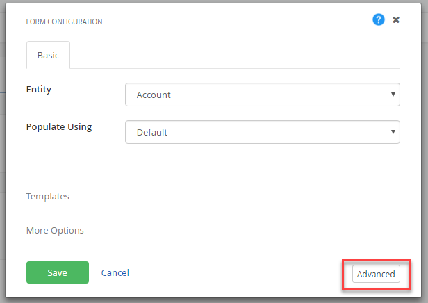
The Portal Connector Team can do this by providing a configuration experience for the more common scenarios, while also providing more advanced functionality under each widget's advanced properties. The advanced properties for each widget can be found on the bottom right corner of the designer window:

Back-End Widgets Secret Configurations
Grids
- Sub Grid (Form Widget)
- SharePoint Document Grid (Form Widget)
- Grid (Page Widget)
All of The Portal Connector grids are based on KendoUI Grids and we utilize this API to give our clients a richer user experience. Therefore, we provide all the functionalities that KendoUI provides.
Grid customization properties can be found under Grid Widget Designer > Advanced > Model > Grid Settings. In addition to that, Sub Grids have their own Sub Grid Properties that can be found under Sub Grid Widget Designer > Advanced > Model > Sub grid Settings.
Grid Date Formatting
To apply a format on date fields in the CRM Grid:
- On Grid widget, click on Edit to display the properties page
- Click on the ‘Columns’ tab
- Click on the Edit button for a date column
- Update the value for ‘Format HTML’ to {0:MM/dd/yyyy}
- Click on Update, then click Save on Column tab.
FetchXML Tricks
Here are some of the handy variables that you can add in to your FetchXML:
|
Variable
|
Description
|
|
@now@
|
Current date and time
|
|
@today@
|
Current Date month year("yyyy-MM-dd")
|
|
@today.year@
|
Current year
|
|
@today.month@
|
Current Month
|
|
@today.day@
|
Current Day
|
|
Saved Queries Only
|
|
@contactid@
|
User contact id
|
|
@parentcustomerid@
|
Parent user customer Id
|
|
@pricelistid@
|
Price list id
|
|
@crmuserid@
|
Crm User ID
|
|
@P#:encrypted@
|
decrypts the parameter
|
|
contactid:encrypt
|
encrypts the attribute in saved query
|
Right to Left Support
By default, our widgets are set up to be left to right. However, on all of our page widgets we have the option to support right to left. You can enable this by simply opening any Page Widget Designer > Advanced > Model and setting EnableKendoRtlSupport to True.
Kendo & Bootstrap Themes
By default, all of our widgets are themed with the Bootstrap framework. KendoUI also provides a theme for all their widget and we have set it to Bootstrap. Here are few steps to enable and disable any of these theme options:
- Remove KendoUI Themes: You can easily enable or disable the KendoUI theme by simply opening any of Page Widget Designer > Advanced > EnableKendoThemes
- Change the KendoUI Themes: You can easily change the theme by simply opening any of Page Widget Designer > Advanced > KendoTheme. (click here for a list of available themes)
- Disable Bootstrap: You can easily disable or enable Bootstrap styles by simply opening any of Page Widget Designer > Advanced > EnableBootstrapStyles.
Common Form Widget Secrets
You can find all these properties under any of the Form Widget Designers > Advanced > Model
- Hide Title – This property will allow you to hide the title/label of the widget.
- Label Position – This property will allow you to have the widget label side by side by setting the Label Position property to “Left”. By default, it is set to “Top”.
- Require Indication Label – When any of the forms widget are set to be required, you can change the required indication by changing the RequireIndicationLabel property.
- ToolTips – You can add tooltips to any of our widgets by modifying the ToolTips Property and you can set the position of the tooltips by modifying the ToolTipPosition property.
See here for Part 2 in this Portal Connector Secrets blog series.